by Neil Kearney | Jun 5, 2017 | Boulder County Housing Trends, Statistics
Boulder County Has One of the Most Consistently Strong Real Estate Markets In The Nation
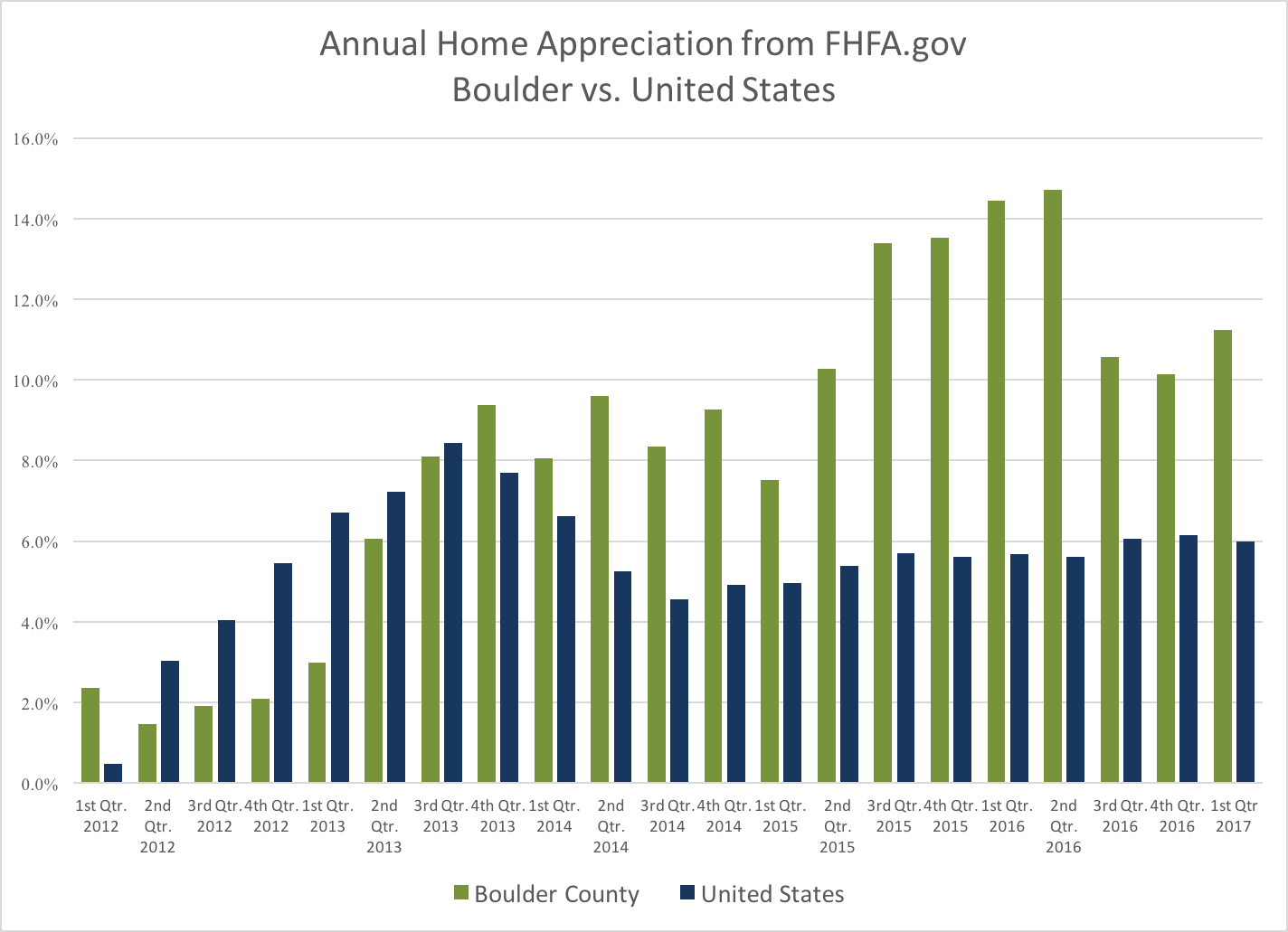
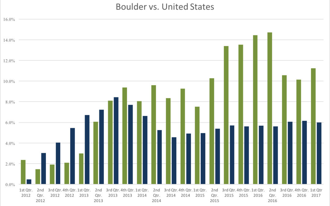
According to the most recent FHFA.gov Home Price Index quarterly report the one year appreciation in Boulder County for the period ending March 31, 2017 was 11.23%. This ranks us 12th highest in the nation out of the 257 largest Metropolitan Statistical Districts that were studied. Our area has been ranked in the top 15 for eight straight quarters including a #1 ranking for the period ending June 30th 2016. The first chart below shows the annual appreciation reported on a quarterly basis for both Boulder County (green) and the United States average (blue). The last five years have been one of our strongest “bull runs” in our history. Over the past five years, the average home has appreciated 55%.

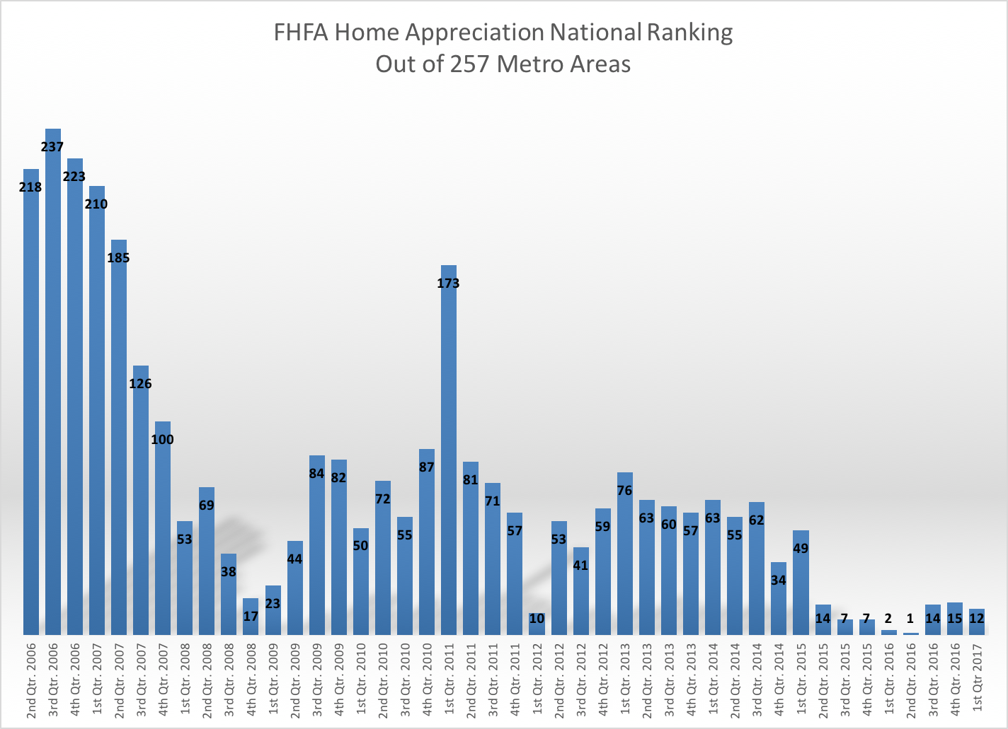
The chart below shows our national ranking compared to the 257 other markets in the FHFA report since 2nd quarter of 2006. This is an interesting graph because it shows that just before the economic downturn in 2008 our market was actually in the last quartile. Our annualized returns at that time were in the 1 to 3% range. As the downturn started and the real estate market came to a grinding halt our ranking improved compared to the rest of the country. During 2008 our appreciation remained above +2%. From 2009 – 2011 our average annual appreciation ranged from +2% to -2.8%. It turns out that we were one of the most stable markets in the country.

This got me to thinking about how we compare to other currently “hot” markets over the last 5 and 10 year time frames. First I identified the areas that currently are ahead of Boulder County in appreciation over the past five years. With 55% appreciation we are ranked 28th in the nation. Reno, NV is ranked #1 with 86% appreciation over the past five years. Here is the list showing the ranking over the past five years. The table is sorted by the highest to lowest in the bolded column.
| City |
2007-2012 Appreciation |
20012-2017 Appreciation |
10 Year Appreciation |
|
| Reno, NV |
-51% |
86% |
35% |
1 |
| Modesto, CA |
-58% |
84% |
26% |
2 |
| Stockton, CA |
-57% |
82% |
25% |
3 |
| Bend, OR |
-43% |
79% |
36% |
4 |
| Las Vegas, NV |
-60% |
78% |
18% |
5 |
| Merced, CA |
-61% |
75% |
14% |
6 |
| San Francisco, CA |
-21% |
73% |
52% |
7 |
| Oakland, CA |
-35% |
73% |
38% |
8 |
| Santa Rosa, CA |
-37% |
69% |
32% |
9 |
| West Palm Beach, FL |
-46% |
69% |
23% |
10 |
| Napa, CA |
-40% |
69% |
29% |
11 |
| Port Lucie, FL |
-52% |
68% |
16% |
12 |
| Yuba City, CA |
-49% |
67% |
18% |
13 |
| Sarasota, FL |
-47% |
67% |
20% |
14 |
| Cape Coral, FL |
-50% |
67% |
16% |
15 |
| Phoenix, AZ |
-48% |
67% |
19% |
16 |
| San Jose, CA |
-23% |
66% |
43% |
17 |
| Salinas, CA |
-51% |
66% |
14% |
18 |
| Sacramento, CA |
-43% |
64% |
21% |
19 |
| Miami, FL |
-46% |
64% |
18% |
20 |
| Denver, CO |
-5% |
62% |
57% |
21 |
| Riverside, CA |
-49% |
62% |
14% |
22 |
| Palm Bay, FL |
-47% |
62% |
15% |
23 |
| Portland, OR |
-22% |
59% |
36% |
24 |
| Boise, ID |
-36% |
58% |
22% |
25 |
| Daytona Beach, FL |
-49% |
57% |
8% |
26 |
| Greeley, CO |
-13% |
57% |
44% |
27 |
| Boulder, CO |
2% |
55% |
56% |
28 |
Now here is the list sorted for the previous five year time period 2007 – 2012. This represents the end of a bull market in many areas and then through the heart of the housing recession. During this time period Boulder is ranked #1 with 2% appreciation, Denver is ranked #2 with -5%.
| City |
2007-2012 Appreciation |
20012-2017 Appreciation |
10 Year Appreciation |
| Boulder, CO |
2% |
55% |
56% |
| Denver, CO |
-5% |
62% |
57% |
| Greeley, CO |
-13% |
57% |
44% |
| San Francisco, CA |
-21% |
73% |
52% |
| Portland, OR |
-22% |
59% |
36% |
| San Jose, CA |
-23% |
66% |
43% |
| Oakland, CA |
-35% |
73% |
38% |
| Boise, ID |
-36% |
58% |
22% |
| Santa Rosa, CA |
-37% |
69% |
32% |
| Napa, CA |
-40% |
69% |
29% |
| Sacramento, CA |
-43% |
64% |
21% |
| Bend, OR |
-43% |
79% |
36% |
| Miami, FL |
-46% |
64% |
18% |
| West Palm Beach, FL |
-46% |
69% |
23% |
| Palm Bay, FL |
-47% |
62% |
15% |
| Sarasota, FL |
-47% |
67% |
20% |
| Phoenix, AZ |
-48% |
67% |
19% |
| Riverside, CA |
-49% |
62% |
14% |
| Daytona Beach, FL |
-49% |
57% |
8% |
| Yuba City, CA |
-49% |
67% |
18% |
| Cape Coral, FL |
-50% |
67% |
16% |
| Reno, NV |
-51% |
86% |
35% |
| Salinas, CA |
-51% |
66% |
14% |
| Port Lucie, FL |
-52% |
68% |
16% |
| Stockton, CA |
-57% |
82% |
25% |
| Modesto, CA |
-58% |
84% |
26% |
| Las Vegas, NV |
-60% |
78% |
18% |
| Merced, CA |
-61% |
75% |
14% |
When you sort for total appreciation over the past 10 years (right column) you see that Denver and Boulder are neck and neck with 57% and 56% respectively. San Francisco is ranked in 3rd place with 52%.
| City |
2007-2012 |
20012-2017 |
10 Year Appreciation |
| Denver, CO |
-5% |
62% |
57% |
| Boulder, CO |
2% |
55% |
56% |
| San Francisco, CA |
-21% |
73% |
52% |
| Greeley, CO |
-13% |
57% |
44% |
| San Jose, CA |
-23% |
66% |
43% |
| Oakland, CA |
-35% |
73% |
38% |
| Portland, OR |
-22% |
59% |
36% |
| Bend, OR |
-43% |
79% |
36% |
| Reno, NV |
-51% |
86% |
35% |
| Santa Rosa, CA |
-37% |
69% |
32% |
| Napa, CA |
-40% |
69% |
29% |
| Modesto, CA |
-58% |
84% |
26% |
| Stockton, CA |
-57% |
82% |
25% |
| West Palm Beach, FL |
-46% |
69% |
23% |
| Boise, ID |
-36% |
58% |
22% |
| Sacramento, CA |
-43% |
64% |
21% |
| Sarasota, FL |
-47% |
67% |
20% |
| Phoenix, AZ |
-48% |
67% |
19% |
| Miami, FL |
-46% |
64% |
18% |
| Las Vegas, NV |
-60% |
78% |
18% |
| Yuba City, CA |
-49% |
67% |
18% |
| Cape Coral, FL |
-50% |
67% |
16% |
| Port Lucie, FL |
-52% |
68% |
16% |
| Palm Bay, FL |
-47% |
62% |
15% |
| Salinas, CA |
-51% |
66% |
14% |
| Merced, CA |
-61% |
75% |
14% |
| Riverside, CA |
-49% |
62% |
14% |
| Daytona Beach, FL |
-49% |
57% |
8% |
Over time, our consistently good market has been fueled by limited building, a growing population, a strong and diverse economy and a location with a lifestyle where people want to live. Although I don’t expect that our market will continue to appreciate at it current pace, alas it is all a cycle, I do think that these factors will continue to make our market one of the most consistent in the nation. A great place to invest.

by Neil Kearney | May 24, 2017 | Boulder County Housing Trends, Statistics
 I have just published The Kearney Report for the 1st Quarter of 2017. The entire report can be viewed below on this page or you can download the PDF link here The Kearney Report 1st Quarter 2017
Real Estate Market Update
The Boulder area real estate market has been one of the most robust markets in the nation over the past few years. The market has been characterized by steady sales, low inventory and rapidly rising prices. This trend continued through the first quarter of 2017.
During the first quarter of 2017 there were 847 sales in Boulder County which reflects a 5% drop from the previous year. The median sales price during the quarter was $465,000 which is 9% higher than it was a year ago. Inventory, especially towards the end of the quarter and then extending into April and May has increased giving buyers more breathing room to shop for homes. During the first quarter, 35% of the sales had a price above the list price, 20% were at the asking price and 45% were below. Of those that did sell above list price the average premium paid was 4.4%. During the first quarter of 2016, 42% sold above list price and the average premium paid was 5.5%. It seems that calling this a slow down is splitting hairs but during that same period it was my experience that showings were down and the number of offers received on any one property was down as well.
Through the end of April the total number of residential sales in Boulder County is up roughly 1% with January and March exceeding last year and February and April lagging last years totals. We still do have a great influx of new residents which has been fueling the unusually strong market but whether it be higher interest rates or higher prices, or both, the activity has lessened.
You may have noticed that there are not many for sale signs out there. The inventory of “for sale” homes in Boulder County at the end of the 1st quarter is up 12% from a year ago. There are definitely more choices out there. I have seen many listings that have fit into this predictable pattern: the house gets listed for a high price compared to recent sales in the neighborhood (the hope), after 10 days or so of moderate showings and no offers (the reality) the sellers reduce the price (the chase) hoping to rekindle interest in their home. In my experience it’s more difficult to make an adjustment after 10 days and get interest than it is to price it right in the first place.
As you browse through the rest of the report you will find, for comparison purposes, a number of market measures displayed for each of the submarkets in our area. Enjoy the report.
Here is our advice for buyers and sellers in the current market.
Buyers – Interest rates are increasing slowly and with increased inventory you may be able to avoid competing for a home with other buyers. On average, homes are still selling for just below asking price. If you are patient you may reap the rewards of waiting for a seller to become motivated and find that the price that you pay is reasonable compared to the neighborhood.
Sellers – Properties are still selling however the exuberance of past years isn’t there. This may be a good time to lock in the gains we have seen in the market over the past three years. When pricing your property lean towards reality and away from greedy and you will most likely find a buyer who is on the same page. “Testing” the market can have poor results if you find your house still on the market two weeks later. Price reductions don’t have the same impact of a well priced new listing.


by Neil Kearney | May 23, 2017 | Boulder County Housing Trends, Statistics
Each spring since 2013 the real estate market in Boulder County could be characterized as frenetic. This year the market is a bit more tempered. If you just look at April’s numbers the market seems similar to a year ago. Sales are similar, inventory is up, prices are up… However, despite strong forward looking sales it seems that the market has lost some of the strength we have seen over the past three springs. Houses are staying on the market longer and there are fewer showings on new listings. It will be interesting to see how it plays out but we don’t usually see the market slow down until late June and we are seeing it earlier this year in some segments.
Sales in April were down 9.4% when compared to last April. Year-to-date sales are still up 1% but it seems that this year is losing a bit of steam. Anecdotally, there have been fewer than expected showings on listings and even on popular properties when multiple offers have been received, the numbers of showings and offers is down. The slideshow below illustrates graphically different segments of the local real estate market including; number of sales, inventory (which is rising), under contract percentage etc.
by Neil Kearney | Mar 23, 2017 | Boulder County Housing Trends, Statistics
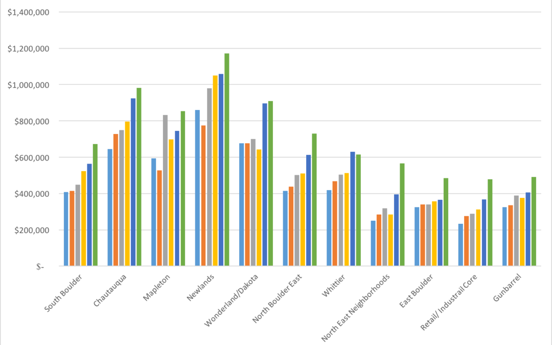
Which Boulder neighborhood has appreciated the most and which are lagging behind? This is a tough question to answer since there are so many variables. But hopefully some data will help to make some sense of that question.
Over the past five years the Boulder area has been on quite a run of price appreciation. Some quick research in the MLS tells me that we have seen 50% appreciation in median prices in Boulder County over the past five years. Breaking it down a bit more, here are the appreciation rates for the local communities over the past five years (from information gathered in IRES MLS):
- Boulder – 66%
- Louisville – 51%
- Lafayette – 60%
- Longmont – 61%
- Superior – 56%
- Erie – 50%
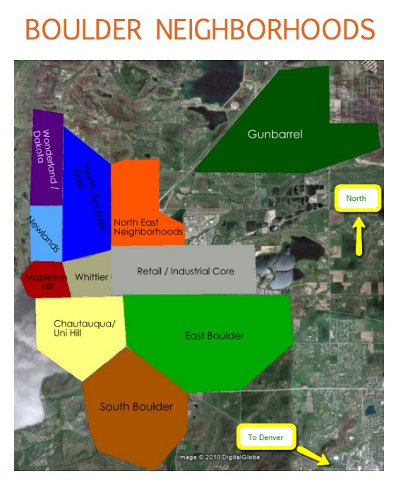
To break it down a bit further I have divided the City of Boulder into eleven distinct neighborhoods. To see more on these neighborhoods please see the Boulder Neighborhood Guide which I update each year. A map of how I have delineated the neighborhoods is below.
With the baseline of 66% appreciation over the past five years, here are the appreciation rates for Boulder neighborhoods.
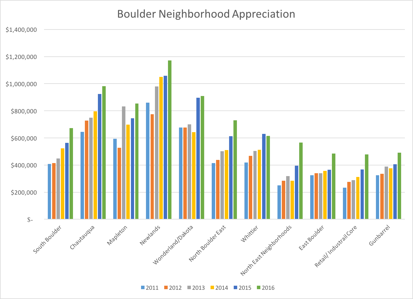
- South Boulder – 65%
- Chautauqua – 52%
- Mapleton Hill – 44%
- Newlands – 36%
- Wonderland Lake/ Dakota Ridge – 34%
- North Boulder East – 76%
- Whittier – 46%
- North East Neighborhoods – 126% (Note- Mostly condos and townhomes in this area with the exception of the Four Mile Creek, Kalmia 38 and Northfield neighborhoods which have seen high priced new builds which have raised the median prices way above the average)
- East Boulder – 49%
- Retail/Industrial Core – 106% (Note – not many sales in this quadrant. New builds at Boulder Junction are bringing up the prices)
- Gunbarrel – 51%
Keep in mind that the sales and prices represented above include both single family and attached dwellings and that the underlying sales are not a constant. For example, some years there are more condos sold, some areas have had new construction, some areas have had many major remodels or scrape off and re-builds. Over time Boulder’s stock of homes are improving. To find evidence of this just drive through Boulder’s neighborhoods and see the number of contractors trucks at work.
by Neil Kearney | Mar 17, 2017 | Boulder County Housing Trends, Statistics
The market is already up and running for the spring season. Inventory is up a bit and the percentage of those listings that are under contract is hovering around 50%. Homes are still selling quick and it’s still a seller’s market but there is not quite as much pressure on the market as there was a year ago. At the end of February, we can see that sales overall were up 3% in the first 2 months of 2017. However, total sales were down 5% in February when compared to last year.
See the slideshow above for graphs and more statistics.
by Neil Kearney | Jan 27, 2017 | Boulder County Housing Trends, Statistics
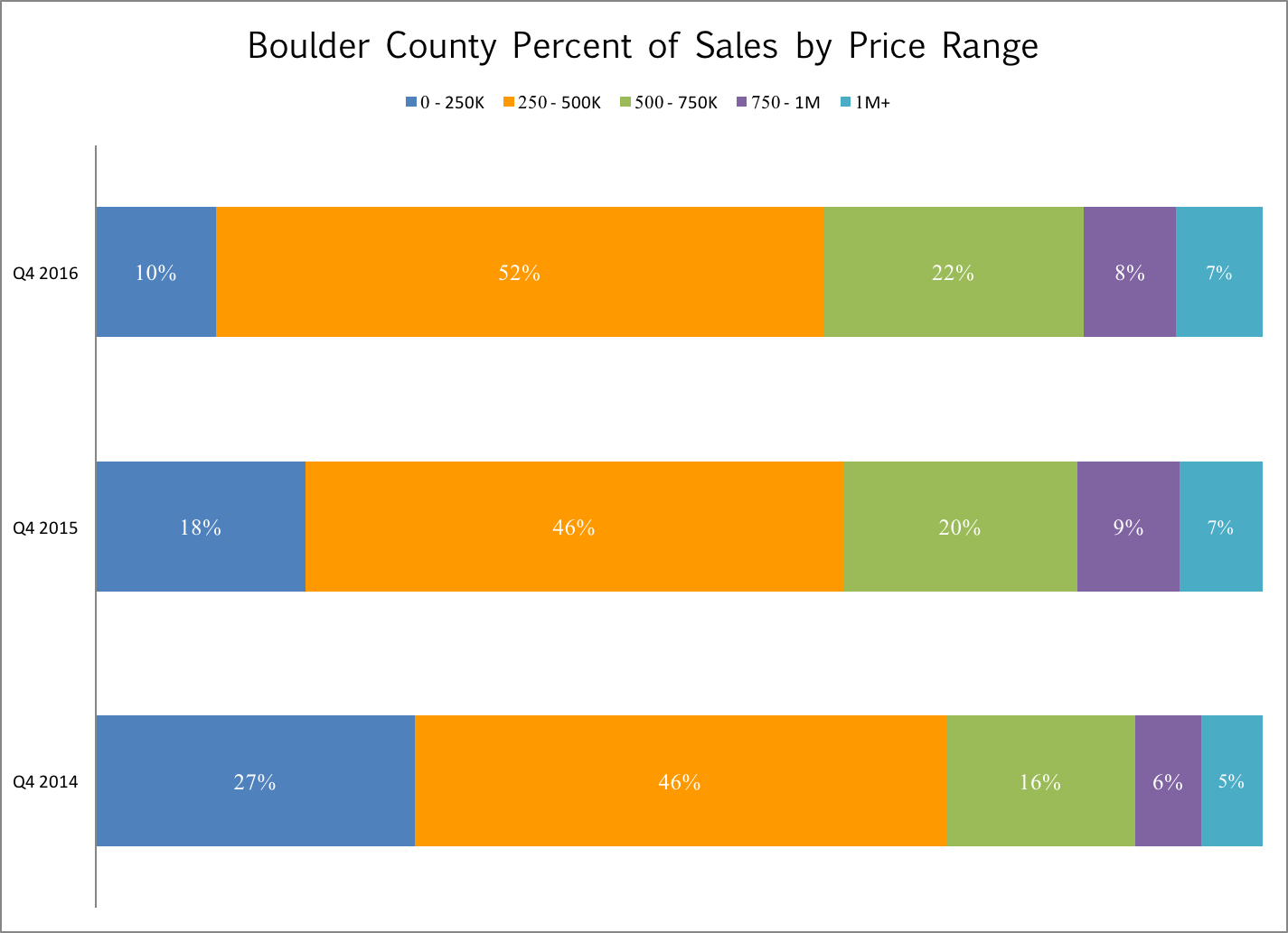
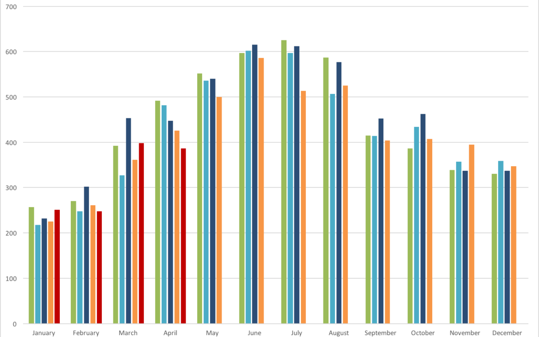
If you are looking for the entire statistical overview of the Boulder real estate market in 2016 check out this comprehensive post and then this one about sales by price range. After working on those year end reviews articles I realized that I had some random charts that may be of interest. These include DTO (Days To Offer); Average Negotiation; and Sales by Area throughout Boulder County.
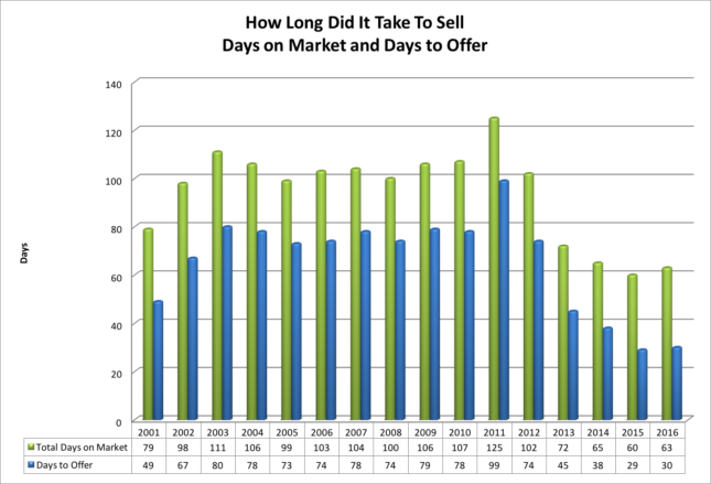
Both Days on Market (DOM) and Days to Offer (DTO) are presented in the chart above. I like DTO better because it gives a more reliable read of the strength o of the market. Days To Offer tells how long it took for an average listing (in this case all residential properties in Boulder County) to go under contract. In 2016 it took on average just 30 days to go under contract. This was one day longer than a year ago but less than half as long as the 15 year average of 66 days. We have been blessed with lots of buyer demand.
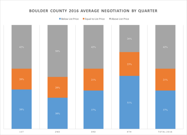
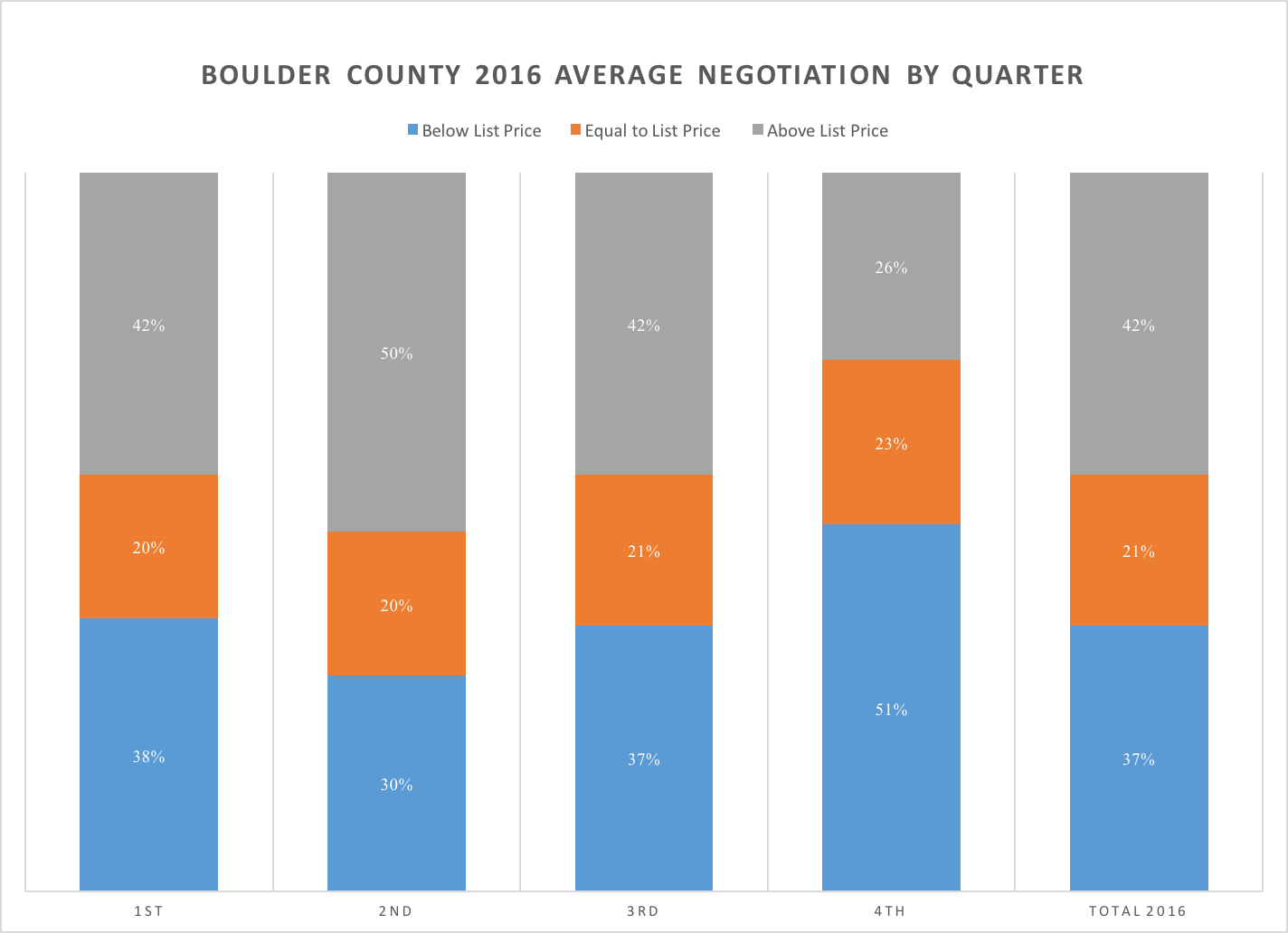
The graph above takes a bit of explanation. Each column represents a quarter except for the one on the far right which represents 2016 as a whole. The graph is measuring the relationship between sales price and listing price. The blue section represents those properties that close below list price (at a discount). The orange section represents those properties that sell for exactly list price. The gray section represents those properties that sell for above list price (at a premium). The data included was both single family and attached homes in Boulder County.
Throughout the year the properties that sold at list price (orange) were consistently between 20% and 35%. In order to get a good sense of the strength of the market look at the gray sections. In the first quarter of 2016, 42% of properties sold for above list price; in the second quarter it was 50%; in the third quarter 42% sold at a premium; and in the fourth quarter the market slowed and just 26% of all sales closed with a price above the list price. On average for the year, if a property did sell at a premium it sold for 4.7% above the list price.
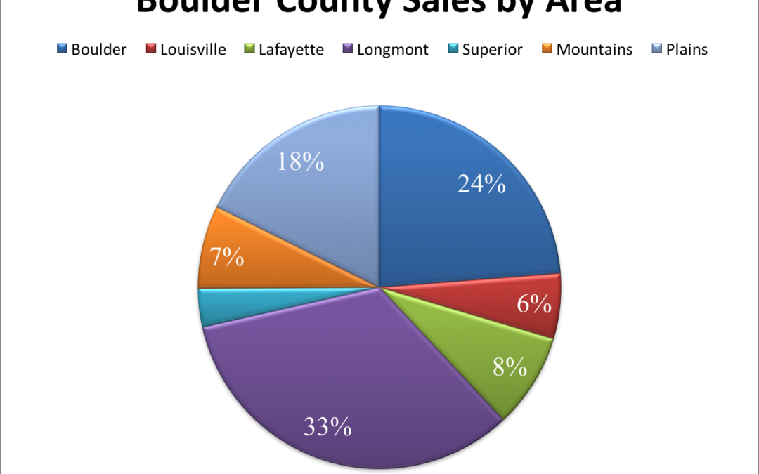
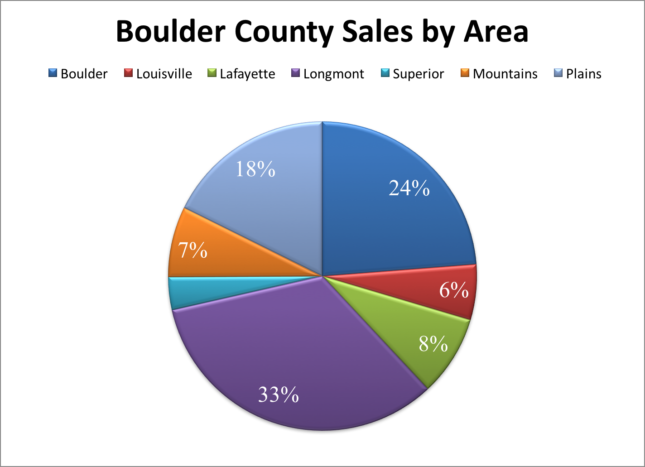 The pie chart above shows the percentage of sales that took place in each of the major communities during 2016. It’s interesting that Longmont has the most sales even though Boulder has more population. Here is a quick comparison of the percentage of the county population and the percentage of the county’s real estate sales.
Community Population % of County pop. % of County sales
Boulder 103,166 33% 24%
Longmont 89,919 29% 33%
Lafayette 26,784 9% 8%
Louisville 19,588 6% 6%
Half of Boulder’s housing units are rentals. This is one explanation why it’s sales lack its population as a percentage.