
If you are looking for the entire statistical overview of the Boulder real estate market in 2016 check out this comprehensive post and then this one about sales by price range. After working on those year end reviews articles I realized that I had some random charts that may be of interest. These include DTO (Days To Offer); Average Negotiation; and Sales by Area throughout Boulder County.
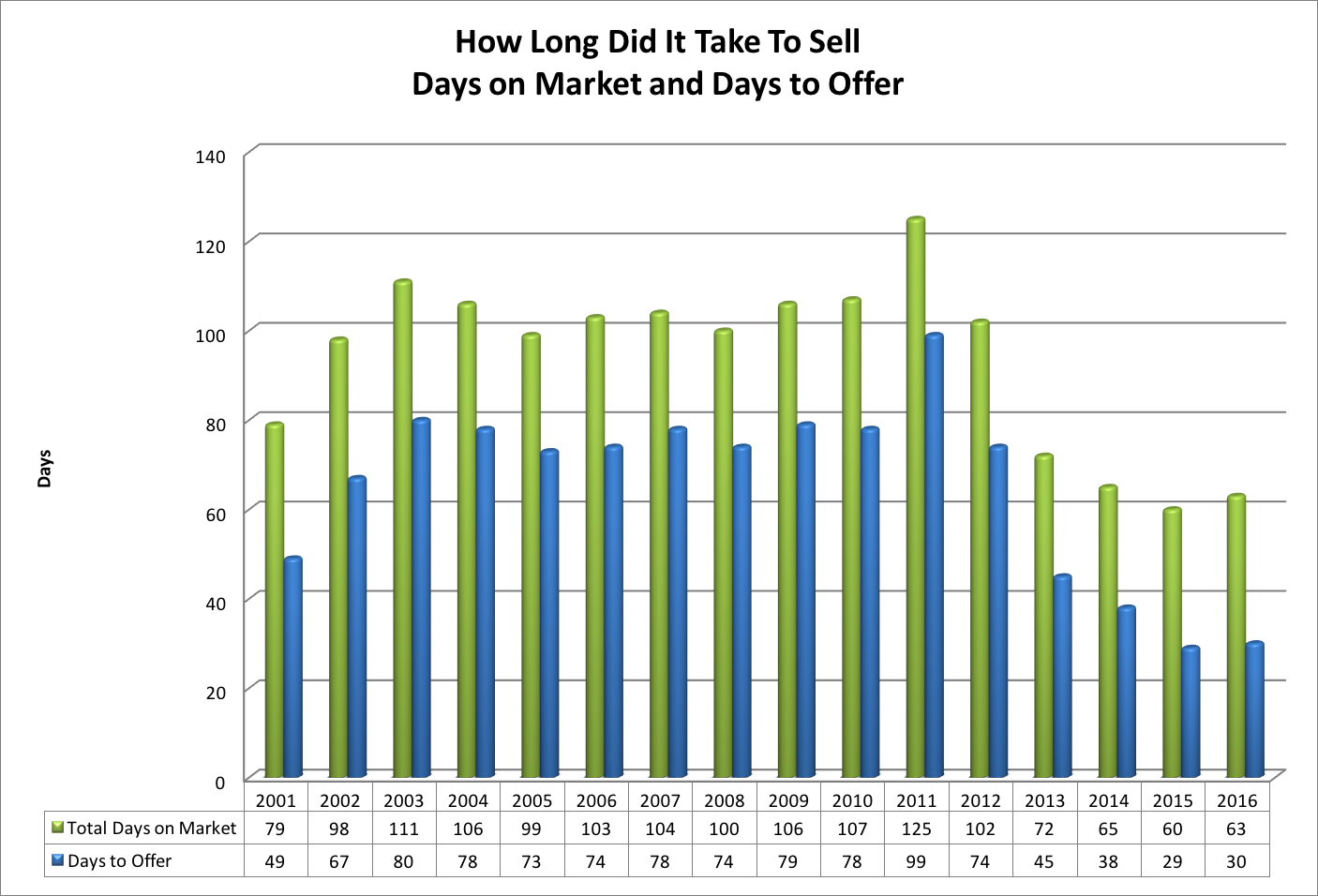
Both Days on Market (DOM) and Days to Offer (DTO) are presented in the chart above. I like DTO better because it gives a more reliable read of the strength o of the market. Days To Offer tells how long it took for an average listing (in this case all residential properties in Boulder County) to go under contract. In 2016 it took on average just 30 days to go under contract. This was one day longer than a year ago but less than half as long as the 15 year average of 66 days. We have been blessed with lots of buyer demand.
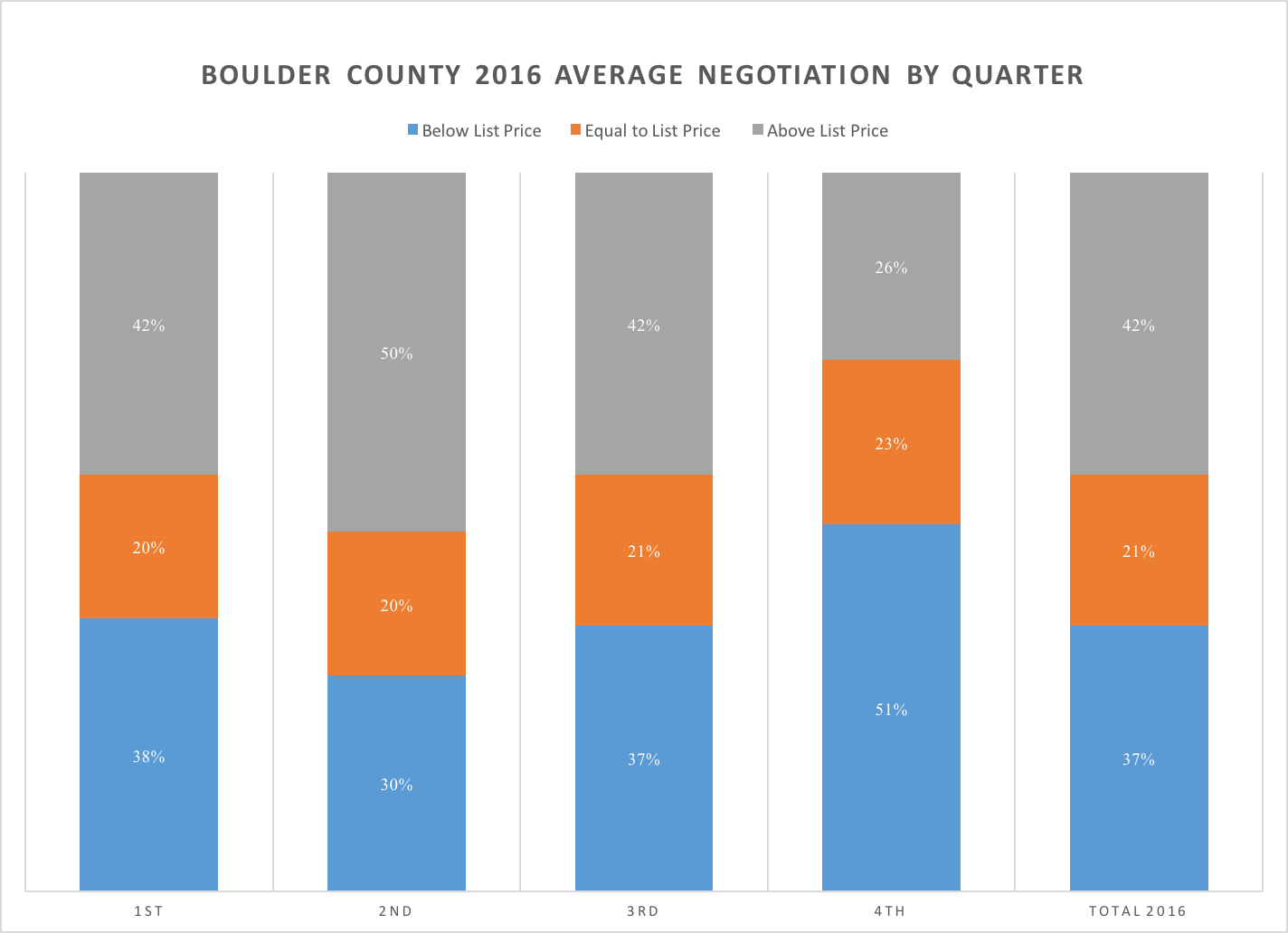
The graph above takes a bit of explanation. Each column represents a quarter except for the one on the far right which represents 2016 as a whole. The graph is measuring the relationship between sales price and listing price. The blue section represents those properties that close below list price (at a discount). The orange section represents those properties that sell for exactly list price. The gray section represents those properties that sell for above list price (at a premium). The data included was both single family and attached homes in Boulder County.
Throughout the year the properties that sold at list price (orange) were consistently between 20% and 35%. In order to get a good sense of the strength of the market look at the gray sections. In the first quarter of 2016, 42% of properties sold for above list price; in the second quarter it was 50%; in the third quarter 42% sold at a premium; and in the fourth quarter the market slowed and just 26% of all sales closed with a price above the list price. On average for the year, if a property did sell at a premium it sold for 4.7% above the list price.
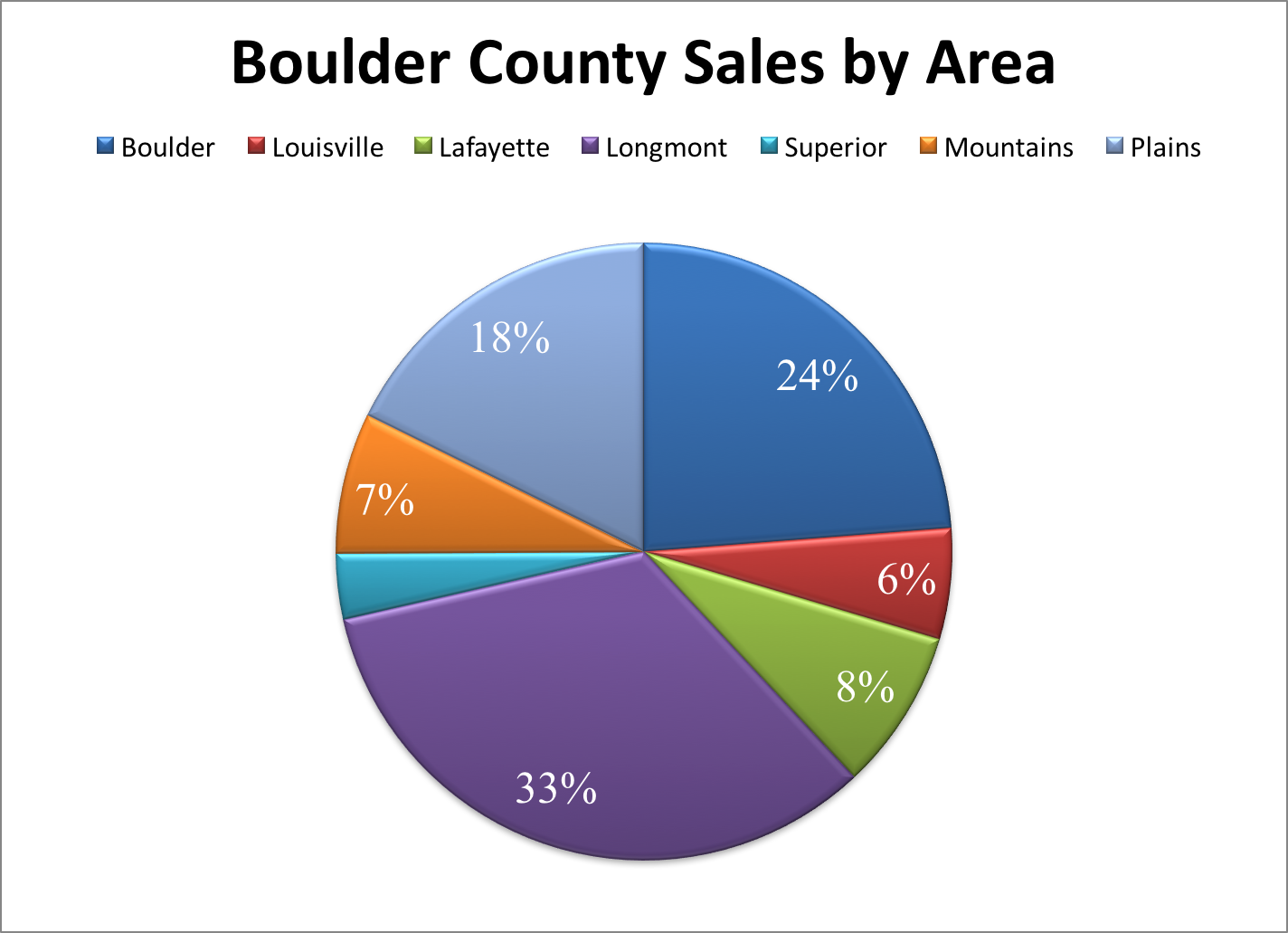 The pie chart above shows the percentage of sales that took place in each of the major communities during 2016. It’s interesting that Longmont has the most sales even though Boulder has more population. Here is a quick comparison of the percentage of the county population and the percentage of the county’s real estate sales.
Community Population % of County pop. % of County sales
Boulder 103,166 33% 24%
Longmont 89,919 29% 33%
Lafayette 26,784 9% 8%
Louisville 19,588 6% 6%
Half of Boulder’s housing units are rentals. This is one explanation why it’s sales lack its population as a percentage.