by Neil Kearney | Dec 10, 2013 | Boulder County Housing Trends, Statistics
Sales took a big drop in November. Down 8.4% from last November and down 12% from October. After 21 straight months of increased year-over-year sales we have now had two straight months of decline.
Year-to-date sales are still up 9.6%.
Inventory, or lack thereof, continues to be a challenge. At the end of October there were just 1440 total listings on the market (single family and condos). This is down from 1818 just two months ago.
We are like a two cylinder car running on full capacity, however we are, figuratively speaking, topping out at just 45 mph. In order to have the market moving forward in 2014 we need to run on 8 cylinders with plenty of gas. We have the capacity all we need are the listings. I suspect the first six months of 2014 will be especially busy. If you are considering selling your house give me a call now so that we can discuss the timing, pricing and getting your house ready to go.
View the slideshow below to see all of the details.

by Neil Kearney | Nov 14, 2013 | Boulder County Housing Trends, General Real Estate Advice
An old adage in real estate is to buy property in the way of development. I’ve never really saw this clearly until a recent trip to Texas. My son and I were looking at colleges and our itinerary included a drive from San Antonio to Dallas. I have never spent much time in Texas so I was looking forward to seeing the countryside. Instead of an education on topography I got a major lesson on population growth with a minor in sprawl studies.
During our five hour drive I kept seeing a reoccurring pattern: city center, industrial area, mall, big box stores, strip malls, outlet mall. It was like a broken reel or an old time cartoon like Speed Racer where the action scenes show the characters driving past the same 6 buildings over and over again. I’d heard about the sprawl in huge cities like Houston but it seemed that along I-35 there was a constant stream of development. This got me thinking about whether investing in areas so far from the city core would be a good idea.
In my town, Boulder Colorado, the growth patterns have been unnaturally halted. There is a band of land between Boulder and its nearest neighbors where no development can take place. The City of Boulder isn’t annexing any land for development and Boulder County won’t approve any new subdivisions unless they are annexed. In addition the City and County have purchased tens of thousands of acres of rural and mountain land around Boulder as open space. This bubble has forced development east of town (can’t go west because of the mountains) to towns like Erie, Lafayette, Longmont and Broomfield. Thirty years ago would have been a great time to buy land in those areas.
We are fortunate to have an area that has a good economy, climate, and lifestyle. People want to live here, so the problem is managing population growth which includes housing, transportation and economic growth in a smart way. I would say that for the most part the foresight of our city leaders long ago has allowed us to maintain a good lifestyle, just with more people sharing.
Not all areas are as fortunate. The financial struggles of Detroit have been in the news lately. In 1950 there were over 1.8 million residents in Detroit now there are just over 700,000. Not only is this bad for the public coffers it is really bad for real estate investment. Simple supply and demand.
So if you are looking at investing in real estate it would be good to consider the population pattern of the area. Is it gaining or losing population? Luckily Forbes has put together a cool interactive map that uses US Census data to track population flow throughout the country. To view and use the map click here. All you need to do is to enter a county or a major city and the migration/immigration statistics will be displayed along with lines that indicate where people are coming from or where they are going to depending upon the pattern. Below are a few screen shots.
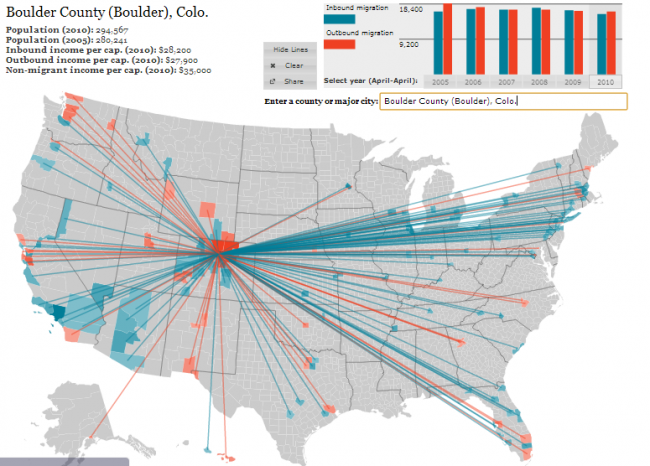
The first map shows the migration pattern for Boulder County. From 2005 to 2010 (last census data), Boulder County gained 14,326 people. A net increase of just under 5%. From the thick blue lines we can see that we have a strong contingent of new residents from the Eastern Seaboard.
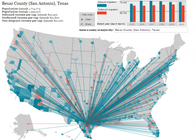
 The second map shows San Antonio Texas. Bexar County gained 185,503 residents between 2005 and 2010! An increase of nearly 11%. No wonder that I noticed the growth.
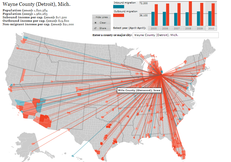
The last map I will show is for Detroit. I’ve already talked about the population declines, but here is how it has looked over the past five years. The red lines show people moving out. Wayne County has lost 7% of it’s population over the past five years. This continues a longer trend as I mentioned earlier.
 I would encourage you to play with the map. Put in your hometown. Put in areas like Phoenix and Las Vegas and Orlando. Then look at the rural Midwest. Once you become familiar with the trends think about how real estate values follow these trends. In the end you want to invest in an area that is gaining population. As a friend of mine says “the number of cheeks must match the number of seats”.

by Neil Kearney | Nov 13, 2013 | Boulder County Housing Trends, Statistics
The Boulder County real estate market is predictably starting to slow as we get nearer the holidays. For the first month this year sales were lower in October (by just 1%) than they were a year ago. Inventory continues to fall. There are currently 31% fewer listings than there were at the same time two years ago. Sales for the first ten months of 2013 are up just over 11% however I expect this number to fall before the end of the year. Last year we had a very strong fall and winter with sales actually increasing during the fall months and this year we are seeing a normal pattern of declining sales as we near the end of the year.
The slide presentation below shows the current statistics compared with the last four years of data on a monthly basis.
by Neil Kearney | Oct 7, 2013 | Boulder County Housing Trends, Statistics
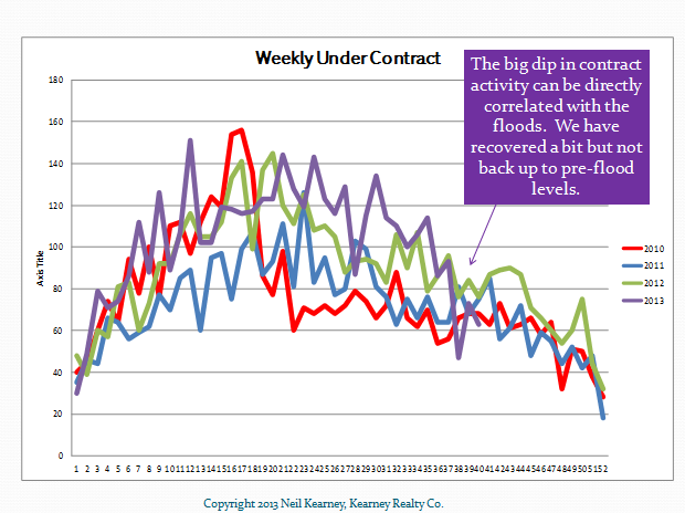
September was a very interesting month for the Boulder real estate market. Sales were strong, but the mid-month flooding definitely broke some momentum in the local home market. Sales of all residential properties increased by 18.6% over September of 2012 and this stretched our year-to-date increase to 12.5%. At the end of the month the percentage of homes that were under contract fell roughly 3 points from a month ago to 26%. This was all good and strong information.
Flooding hit the area starting September 12th and during the next week we saw very little activity in the real estate market. Many homes that had water damage that were on the market were pulled from the market and those that might have come on the market during September didn’t as owners cleaned up and fixed up as needed. The inventory of single family homes on the market in Boulder County dropped 24% from August 31st to September 30th.
As mentioned above the percentage of homes that are under contract fell just three points as compared to last month. However, the gross number of homes that went under contract during the month fell by a significant 25%. Since the number of homes on the market decreased at roughly the same pace of the fall in contracts the overall “under contract %” doesn’t jump out at you until you take a closer look.
To view all of the statistical graphs with my annotations click on the slideshow below.

by Neil Kearney | Sep 11, 2013 | Boulder County Housing Trends, Statistics
Sales were strong again in Boulder County in August. In fact there were 23% more closings this year than there were during August of last year. Year-to-date sales have increased roughly 12%. Sales peaked in July this year with 625 closings throughout the county. In August 587 properties closed which is just 10 units below June.
The current under contract percentage is hovering at 30%. Still a good indication of a strong market but interestingly, this is the first month since May of 2011 where we saw the previous year outpace the current month. Maybe a sign of a slowing market.
Inventory has been gradually increasing since March but we are still 12% the inventory levels of a year ago.
To get a full visual picture of the market please view the slideshow below.
by Neil Kearney | Aug 22, 2013 | Boulder County Housing Trends, Statistics
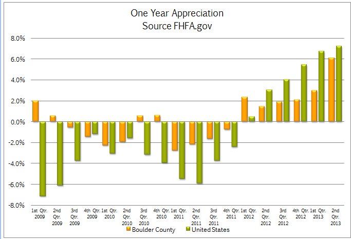
The FHFA.gov Home Price Index was released today and it reported that homes in Boulder County increased in value by 6.06% for the 12 months ending June 30, 2013. During the second quarter alone the home appreciation rate was 2.71%. The annual rate of 6.06% was below the national average of 7.22% but our area was still ranked as 63rd best out of the nearly 300 MSA (Metropolitan Statistical Areas) tracked. The areas that had the most appreciation over the past year were for the most part the areas that were most affected during the most recent recession. These areas included Stockton CA +19.4%, Phoenix AZ +18.47%, Las Vegas NV +17.59%, Bend OR +16.73% and Modesto CA +16.01%. Over the past five years Boulder County has seen overall appreciation of 3.72%. This compares to -4.35% for the United States as a whole. The areas that are showing the most appreciation currently are all still recovering. The areas I just mentioned that have the highest current rate of appreciation are all negative over the past five years. Stockton CA – 18.99%, Phoenix AZ – 24.85%, Las Vegas NV – 38.84%, Bend OR -27.20% and Modesto CA -25.16%. In fact the only area in the current top 20 with a positive 5 year return is Bismarck ND with a one year return of 14.07% and a five year gain of 28.75%. The chart below shows the comparative appreciation rates of Boulder County to the United States as a whole.  The areas that are still lagging and are showing negative home appreciation tend to be in the South, and the rust belt. Here is a list of the bottom 10 markets as measured by FHFA.gov.
- Norwich CT – 3.36% (1 year), -19.6% (5 year)
- Gulfport MS -3.23%, -21.59%
- Rockford IL -2.67%, -19.82%
- Mobile AL -2.63%, -18.91%
- Fayetteville AL -1.77%, -3.47%
- Huntington/Ashland WV, KY, OH -1.71%, +.98%
- Huntsville AL -1.6%, -4.24%
- Scranton PA -1.59%, -6.04%
- Decatur IL -1.38%, -2.45%
- Toledo OH -1.16%, -13.65%