by Neil Kearney | Sep 9, 2016 | Boulder County Housing Trends, Statistics
Quick Real Estate Market Wrap Up
The market has slowed – houses are staying on the market longer, average negotiation off of list price was 1.5% in August instead of above full price which has been the case during the spring months, and there are fewer showings taking place. Sales were down 9% in August from the same month last year and year-to-date sales are down approximately 10%. On the good news front, at the end of the second quarter Boulder County was the #1 area for home appreciation in the nation. The last two years we have seen good activity in the fall, this year it feels like it won’t be quite as strong. However, it’s all relative, we still have a vibrant strong market. Maybe we won’t be #1 for long but we still have a great market and a place where people want to live.
Prices are still high but we are seeing more price reductions and fewer multiple offer situations. A respite for buyers. Enjoy the slideshow which highlights the trends in Boulder County real estate over the past five years.
by Neil Kearney | Aug 12, 2016 | Boulder County Housing Trends, Statistics
The Kearney Report – Second Quarter 2016
If you are looking for a comprehensive look into the real estate market in Boulder County look no further than the latest version of The Kearney Report. In the report I have outlined the highlights of the Boulder County real estate market. Click on this link to view and download the report (no strings attached).
Or you can view the report right on the page below.
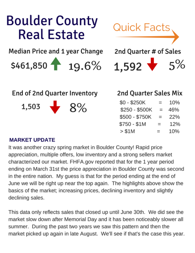
It was another crazy spring market in Boulder County! Rapid price appreciation, multiple offers, low inventory and a strong sellers market characterized our market. FHFA.gov reported that for the 1 year period ending on March 31st the price appreciation in Boulder County was second in the entire nation. My guess is that for the period ending at the end of June we will be right up near the top again. The highlights above show the basics of the market; increasing prices, declining inventory and slightly declining sales.
This data only reflects sales that closed up until June 30th. We did see the market slow down after Memorial Day and it has been noticeably slower all summer. During the past two years we saw this pattern and then the market picked up again in late August. We’ll see if that’s the case this year.
<div data-configid="1183676/37842504" style="width:525px; height:679px;" class="issuuembed"></div> <script type="text/javascript" src="//e.issuu.com/embed.js" async="true"></script>
From the Section on The City of Boulder…
Sales in Boulder were down 12% during the second quarter and are down 14% for the year but that’s not the story. The story is the rapid increase in prices. The median price of all properties (single family and condos) increased by 32.5% over the one year period ending March 31st. The average for all of Boulder County during that same time frame was 20%. So what gives? First of all, this is a spot number of sales just during the quarter. It doesn’t average sales over a number of months. Secondly, you may have noticed all of the construction trucks and oversized dumpsters all over town – houses are being improved and therefore we are not comparing the same apples over time. But even with those factors the market in Boulder has been very strong. Especially for the moderate (for Boulder) price ranges under $1 million. During the quarter 24% of the sales in Boulder sold for over $1 million.
In the report there are sections for Boulder County, City of Boulder, City of Longmont and East County which includes Louisville, Lafayette, Erie and Superior.
by Neil Kearney | Aug 8, 2016 | Boulder County Housing Trends, Statistics
Boulder Home Appreciation – 14.44% for the year and 41% over 5 years
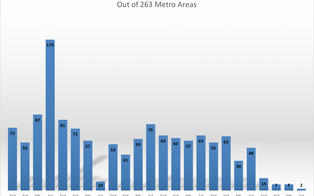
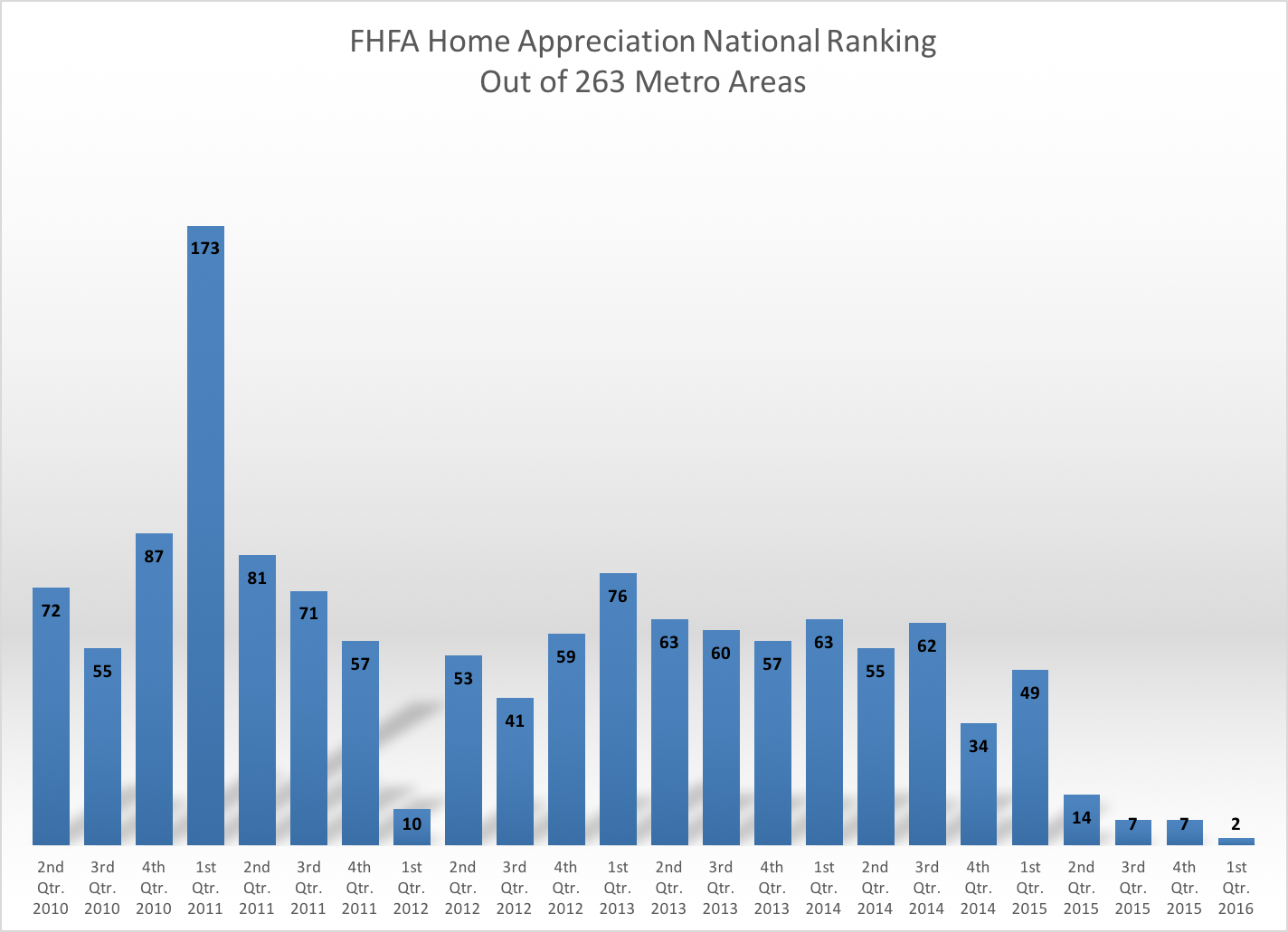
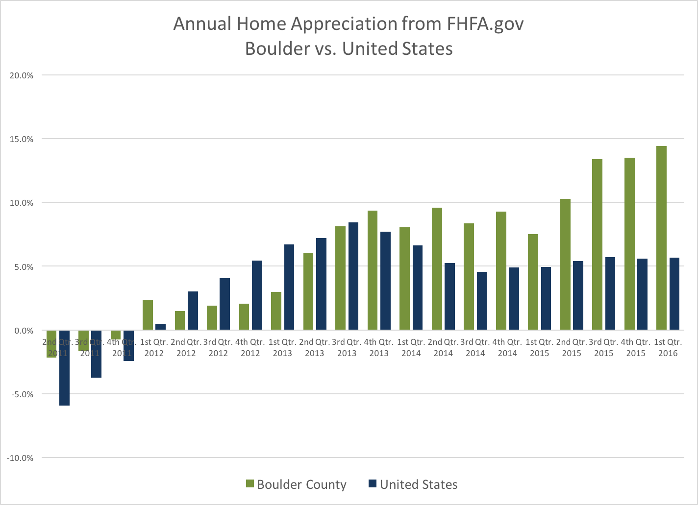
Each quarter FHFA.gov releases their Home Price Index. It is a report that tracks prices of homes in areas throughout the United States. This most current report ranked 263 MSA’s (Metropolitan Statistical Areas) and Boulder (actually all of Boulder County) was ranked #2 for home appreciation for the one year period ending March 21, 2016. The last time we were ranked so high was back in 1999 – 2000 when we were ranked #1 nationally. According to their study which relies heavily upon same house sales, houses in our area gained, on average 14.44% during the one year period. The first of the two graphs below show the history of our national ranking and the second one shows our home appreciation compared to the United States.
Taking a Deeper Look – Comparing 10 year appreciation of 20 hottest real estate markets
When you rank highly in anything for a 1 year period it doesn’t begin to tell the entire story. The old adage is what goes up must come down (I think Issac Newton said that). But in real estate that isn’t always true. So here is deeper look at the current top twenty real estate markets for home appreciation. In this list there are six markets in Florida, four from Colorado, four in California, two each in Oregon and Washington, and one in Nevada and Texas. Click on the tabs below to see the rankings for 1 year, 5 year and 10 year.
Ranking of the Top 20 Real Estate Markets in the U.S. - 1 Year Appreciation
Here are the top 20 markets ranked for 1 year appreciation for the period ending March 31, 2016.
- Port Lucie, FL – 14.68%
- Boulder, CO – 14.44%
- Bend/Redmond, OR – 14.09%
- Reno, NV – 13.97%
- Denver/Aurora/Lakewood, CO – 13.74%
- San Francisco, CA – 13.33%
- Sarasota, FL – 13.21%
- Napa, CA – 13.15%
- Portland, OR – 13.03%
- Greeley, CO – 13.02%
- Melbourne, FL – 12.67%
- Seattle, WA – 12.63%
- Fort Collins, CO – 12.54%
- Oakland, CA – 12.05%
- Fort Myers, FL – 11.81%
- West Palm Beach, FL – 11.46%
- Mount Vernon, WA – 11.23%
- Miami, FL – 11.23%
- San Jose, CA – 11.17%
- Dallas, TX – 10.92%
Ranking of the Top 20 Real Estate Markets in the U.S. - 5 Year Appreciation
Here are the current hottest markets in nation ranked for five year appreciation. The number in parenthesis is their current one year ranking.
- Bend/Redmond, OR – 69.90% (3)
- San Francisco, CA – 59.65% (6)
- Fort Myers, FL – 58.05% (15)
- Napa, CA – 56.88% (8)
- San Jose, CA – 56.15% (19)
- Reno, NV – 55.82% (4)
- Oakland, CA – 54.37% (14)
- Miami, FL – 47.82% (18)
- Sarasota, FL – 47.40% (7)
- Port Lucie, FL – 47.35% (1)
- Denver/Aurora/Lakewood, CO – 47.02% (5)
- West Palm Beach, FL – 45.96% (16)
- Greeley, CO – 44.94% (10)
- Boulder, CO – 40.96% (2)
- Fort Collins, CO – 39.36% (13)
- Portland, OR – 38.77% (9)
- Melbourne, FL – 37.35% (11)
- Seattle, WA – 36.43% (12)
- Dallas, TX – 35.95% (20)
- Mount Vernon, WA – 16.65% (17)
Ranking of the Top 20 Real Estate Markets in the U.S. - 10 Year Appreciation
Unless you are timing the market this is the one that matters!
Over the past year we have experienced an extreme housing crisis and the recovery. So when you look at the 1 year or the 5 year appreciation numbers you definitely don’t get the full picture. Here are the current hottest markets in nation ranked for appreciation over the past 10 years. The number in parenthesis is their ranking over the past five years during the recovery.
- Denver/Aurora/Lakewood, CO – 42.40% (11)
- Boulder, CO – 41.35% (14)
- San Francisco, CA – 40.88% (2)
- Fort Collins, CO – 35.36% (15)
- San Jose, CA – 34.65% (5)
- Bend/Redmond, OR – 32.25% (1)
- Dallas, TX – 32.29% (19)
- Greeley, CO – 29.73% (13)
- Portland, OR – 27.32% (16)
- Seattle, WA – 25.64% (18)
- Oakland, CA – 20.71% (7)
- Napa, CA – 17.49% (4)
- Miami, FL – 10.22% (8)
- Melbourne, FL – 9.16% (17)
- Reno, NV – 7.72% (6)
- Mount Vernon, WA – 6.59% (20)
- Fort Myers, FL – 3.97% (3)
- West Palm Beach, FL – 2.85% (12)
- Sarasota, FL – .42% (9)
- Port Lucie, FL – (-3.06) (10)
Conclusions
If you look closely at the previous three sections you may have found, as I did, that having the hottest market in the short term sometimes means that it is also the most volatile. For example, homes in Port Lucie, Florida, which had the highest appreciation percentage over the past year and was up 47% over the past five years actually lost value over the past 10 years.
When you look at a longer time frame like 10 years it evens out the short term boom and bust. Boulder and Denver were the #1 and #2 market for appreciation (of this group) over the past 10 years. The top five over the past 10 years are Denver, Boulder, San Francisco, Fort Collins and San Jose. These are the markets that have weathered the long term better than the others.
by Neil Kearney | Jul 28, 2016 | Boulder County Housing Trends, Statistics
Boulder’s real estate market has lately been explained in the press with headlines such as; “Cost of Average Home Surpasses $1 Million” and “What Bubble? Boulder County Ranked As Most Stable Housing Market In U.S.”. At first these seem contradictory. How can a market that has appreciated by 308% be the most stable? The personal finance company SmartAsset analyzed sales data since 1991 and found that Boulder County had steady appreciation without any significant periods of depreciation. In other words, the Boulder real estate market has reaped the rewards without the risk. Since the 1980’s our area has had three periods of rapid appreciation (frenzied market) and we are currently in the midst of the fourth. During the past cycles we have seen four years of rapid price growth followed by a evening of the market. We have not seen a time where we have had a price correction. We have had both strength and stability.
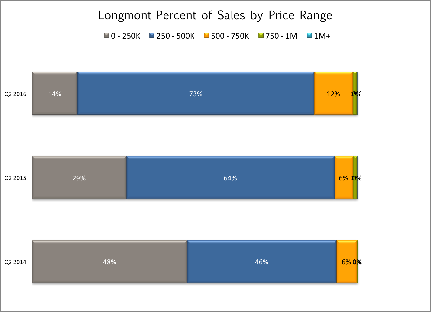
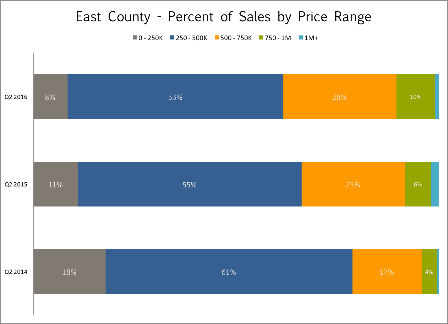
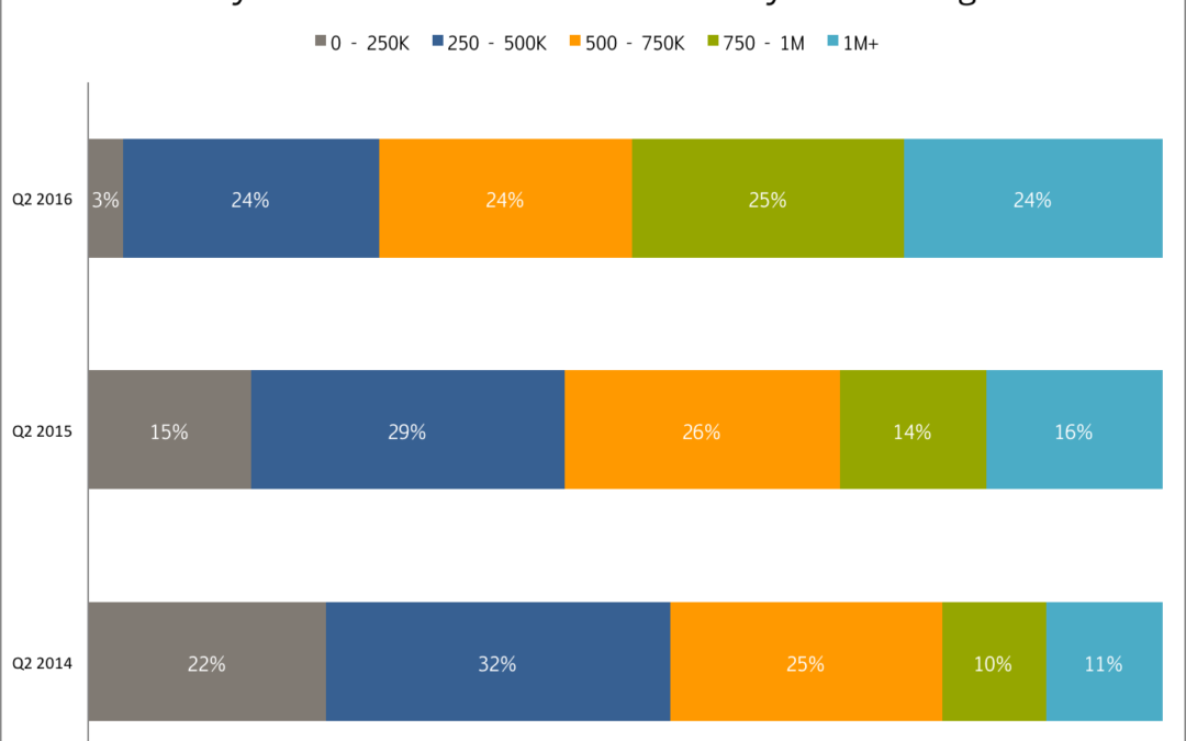
During our current appreciation cycle we have seen between 10% and 15% appreciation each year. For the one year period ended on March 31, 2016 our annual appreciation was 14.4% which ranks our area 2nd in the nation out of 263 areas for that time frame. (FHFA.gov) I recently finished compiling my statistics through the second quarter and I found that a particular graph that shows the sales mix across price ranges compared over the past three years illustrates the price appreciation we have experienced well. What I find most interesting is the rapid disappearance of the starter house/condo under $250,000. In the charts below the most recent quarter is shown on top and is compared to one year ago and two years ago below. In each of the areas (Boulder County, Boulder, East County, and Longmont) the sales mix shift to the right is dramatic.
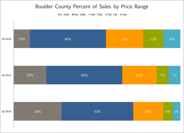
In Boulder County as a whole the entry level price range has dropped from 29% to 10% over the past two years and sales over $1 million have increased from 5% to 10% of the market.
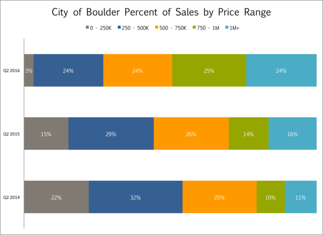
In the City of Boulder these trends are even more dramatic. The entry level has decreased from 22% of the sales to just 3%. There are just a few one bedroom condos left under $250,000. At the same time, homes with a sales price of $750,000 or more have increased from 21% of the market just two years ago to 49% of the market sales.
 Longmont is still the most affordable area in the County with a median price of just under $340,000 and has very few homes that sell above $750,000. However, over the past two years the number of entry level sales has dropped from 48% to 14%.

The sales mix in Louisville, Lafayette, Erie and Superior has changed as dramatically as other parts of the county. There has been a shift to the right but prices in those areas are consistently more in the middle.
The pressure of a frenzied market has relieved a bit as of late, but at the moment it’s unclear whether it’s a pause or a shift in the market. Since it’s normal for activity to slow down this time of year we won’t really know until September. Stay tuned!

by Neil Kearney | Jul 14, 2016 | Boulder County Housing Trends, Statistics
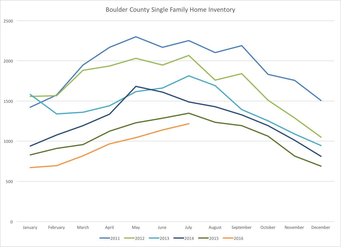
By all accounts the real estate market in the Boulder has been strong. Inventory is down, prices continue to rise quickly and all of the really good homes seem to go for ‘way’ more than full price. However, when you look at the numbers you find that this years market isn’t quite so robust as last year. Sales of homes in Boulder County in the month of June were down 4.7% when compared to a year ago and so far in 2016 total sales have fallen 9%.
However, the lack of sales is more due to a supply problem rather than a demand problem. Inventory of available homes is down 6% from a year ago and 17% from two years ago. The graph below shows the trend of homes on the market over the past five years. Bottom line – fewer homes are coming on the market and that lack of inventory is causing rising prices.
by Neil Kearney | Jul 5, 2016 | Boulder County Housing Trends, Boulder Real Estate
What a difference a few months make. Back in April every new listing was inundated with buyers. Open houses were flash mobs and multiple offers were the norm. Since Memorial Day it seems to be a different market and I’m trying to figure out if the fundamentals have changed or if everyone is just away on vacation.
First of all, this is not an unusual trend. The common perception is that summer is “the” time for real estate sales. That might be true in other places, but in Boulder County spring is king. Every year the market slows down for the summer. Most years it’s in June, last year it was in late July and this year it appears (in hindsight) that it was late May.
Let’s be clear, the market conditions in Boulder County are still good, transactions are still happening, buyers are still out looking, new listings are coming on the market and deals are closings are still happening but it seems that the pressure in the market has waned. Especially in the high end of each towns market.
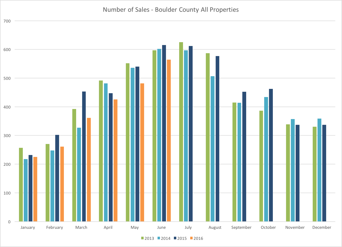
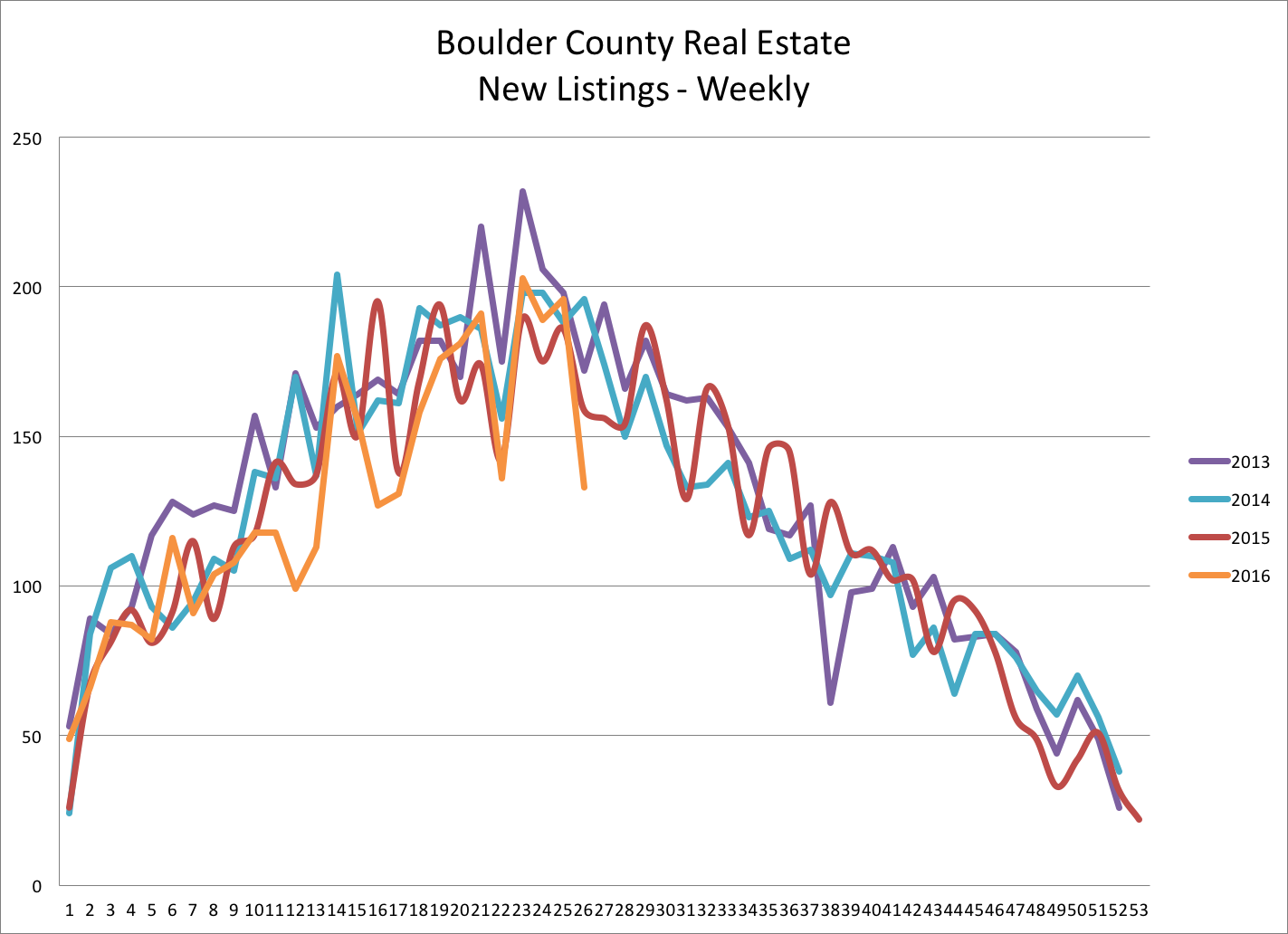
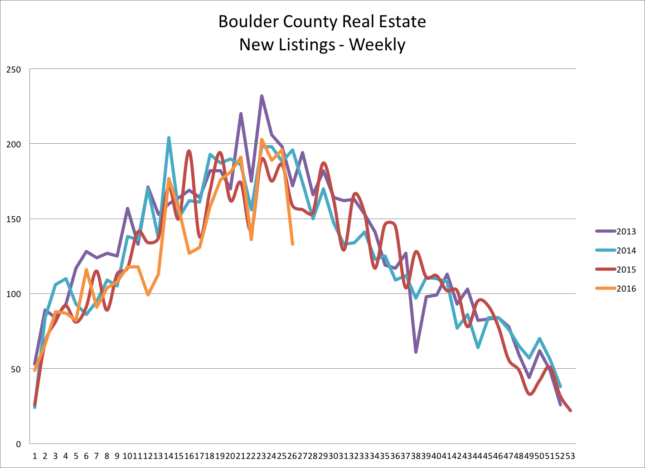
In this article I will present a number of different measures that measure market activity. Cutting to the chase it isn’t clear cut. Let’s begin by looking at sales. This first chart shows the number of closed transactions in Boulder County each month over the past five years. The orange line shows sales in 2016 and it’s clear that we are not keeping up with last year’s torrid pace. Through the first half of the year sales are down 10% from 2015. Inventory is low compared to past years and this has definitely been a cause for the lower activity. When buyers don’t have many houses to see the chances that they find one to buy goes down. This next chart shows the flow of new listings to the Boulder County market (all price ranges and types) on a weekly basis. It appears that new listings peaked back at the end of May and if we follow the trend will be decreasing for the rest of the year.
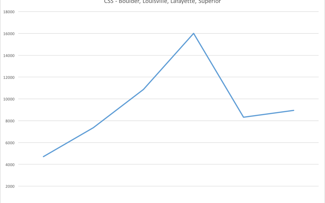
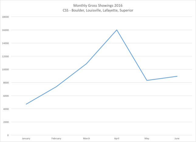
Unfortunately, showings started falling just as more new listings were coming to the market. More listings and fewer showings means that buyers didn’t have the sense of frenzy as they did back in April. The graph below shows the gross showings by month in Boulder Louisville and Lafayette as set by Centralized Showing Service. They don’t handle every showing in town but they have a very significant number and the sample is large enough to call it representative.
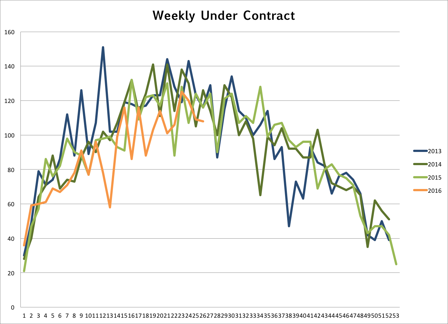
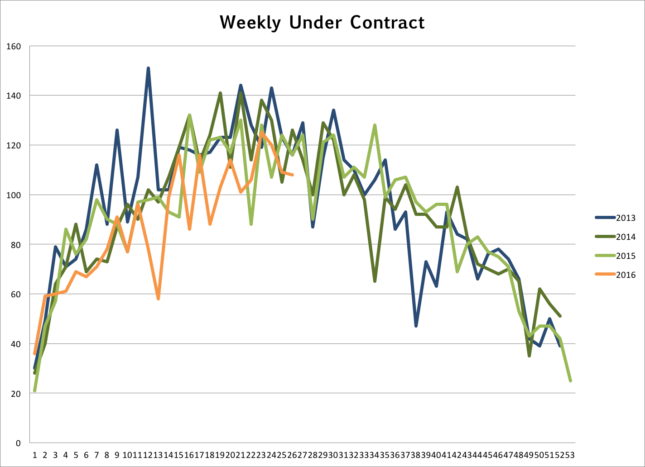
 So far everything makes sense. This is where it gets a bit fuzzy. I track the number houses that go under contract each week in Boulder County. From the graph below it appears that sales are still brisk. This shows equal or more contracts even while there were fewer showings. Obviously there are still buyers out there and finally with less competition they can jump on a property and get their offer accepted. It’s been all too common these past few years for buyers to look around a quite a few houses, find the right one, get beat out in a multiple offer situation and then be forced to start anew. Wash, rinse, repeat! This cycle pumps up showings. In the old days, a new listing comes on the market, buyer sees the listing, buyer likes the listing and then buyer buys the listing. Maybe we are getting back to that. Refreshing!
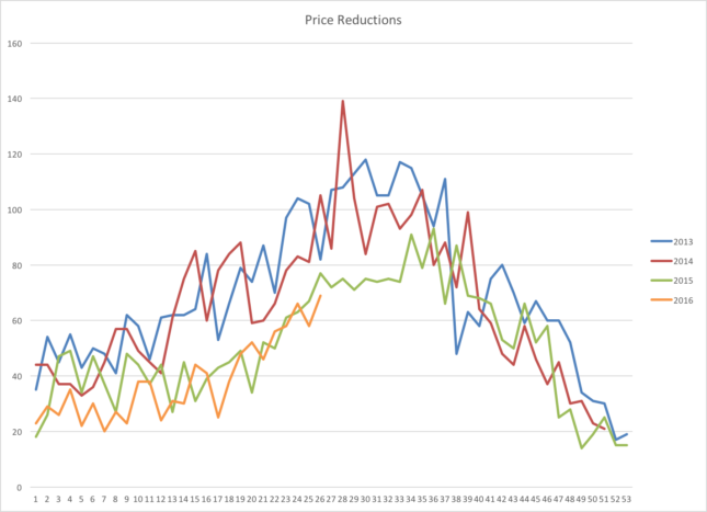
Before I started checking any of these statistics I felt the market slowing. Fewer listings for my buyers to see, not so many people at open houses and houses staying on the market a bit longer (what’s longer than immediately?). In an extreme sellers market sellers sometimes get greedy and when they don’t get their price in the first week to ten days they come back to reality a bit. So it would make sense that there would be more price reductions. Looking at the graph below we can see that the answer to that query is technically yes, but it doesn’t support the hypothesis that the market has changed.
 Given the information below it seems that the market has slowed but it seems more like a vacation than something more permanent. If you need to sell your house this summer you may need to lower the price. If we are patient, we will most likely feel the pressure rise when the buyers are back in town.