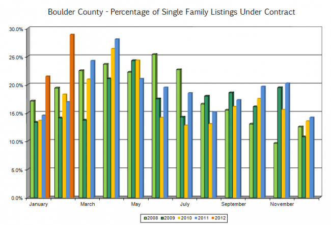
The quick answer is that the supply of new homes in the Boulder area isn’t meeting the demand right now. At the beginning of every month I run some comparative statistics and this month the results were very illustrative. The chart below shows the percentage of listings that are under contract by month from 2008 forward. Each grouping shows the under contract percentage taken on the same day of each year. Look at the big orange bar near the left side. That represents the highest percentage of homes under contract over the past five.

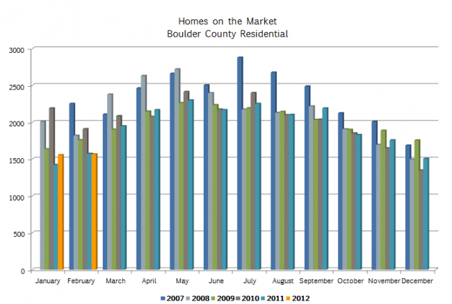
The next chart shows the total number of residential homes on the market in Boulder County. We are nearly at the lowest inventory level for any month over the past five years. Put these two conditions together (high demand, shortage in supply) and we have ourselves a pretty active market.
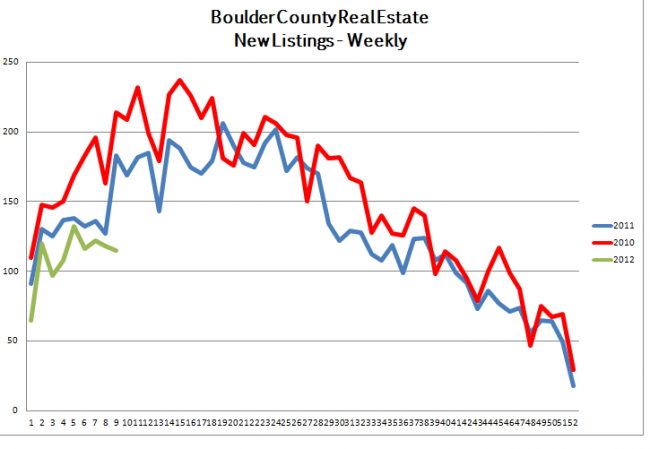
The next two graphs show activity over the past three years on a weekly basis. The first graph shows the number of homes that have been listed. We are on a lower pace of new listings than either of the past two years.
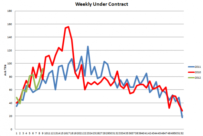
This last graph compares the number of homes that have gone under contract on a weekly basis over the past three years. It shows a much stronger market so far than we had just a year ago.
If you are looking to dip your toe into the Boulder real estate market you will need a good guide. I have been helping people find just the right place to buy and helping sellers successfully market their homes for 20 years. I’d love to put my tools to work for you.


