It’s seems that I’ve been reporting on the same trend for a few years now; declining inventory. I’ve looked at the causes of low inventory and have touched on the effects in many other articles. Today I’m going to analyze new listings with sales so that we can compare markets across years.
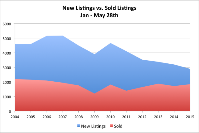
The graph above shows the number of new listings in blue and the number of sold listings in red. The data is from IRES MLS and includes both single family and condo listings in Boulder County. All data is from the time frame of January 1 – May 28th for each year.
If you just look at the sold (red) portion of the graph you will see that overall there has been a slight decline in sales from left to right with a large dip in 2009 and then an uneven recovery. In 2009 sales were down 45% from 2004. Year-to-date in 2015 sales are down 16% from the peak in 2004.
Now looking at the blue portion of the graph you see that new listings have been sliding since 2007 with the exception of a brief respite in the recovery year of 2010. By May 28th of 2007 there had been 5,179 homes listed across Boulder County, so far this year there have been just 2,904. This is a 44% decline in new listings.
So let’s put these two pieces together. Sales are down 16% and new listings are down 44%. This makes for a lack of supply. On the chart you can see the squeeze on the right side of the graph.
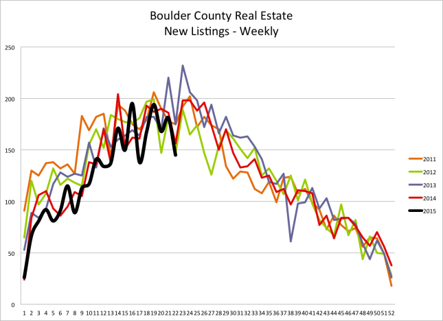
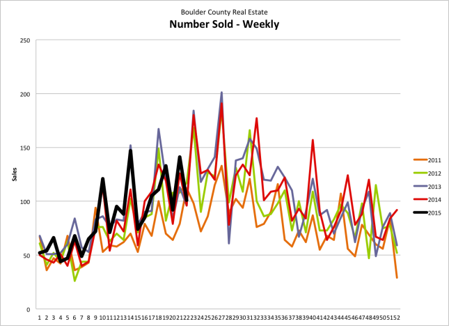
I track the number of new listings, sales and recent under contracts on a weekly basis. The two graphs below show the number of new listings that have come on the market, the number of sales and the number of homes that have gone under contract on a weekly basis. The graphs include five years of data. You can see that the number of sales and under contracts are similar to the comparison years but the number of new listings is lacking.


