
 Click here to download the latest Kearney Report The Kearney Report 1st Quarter 2019
The first quarter of 2019 began as the fourth quarter ended, slower than normal. Through February sales in Boulder County were down 10%. In March sales rebounded a bit and through the first quarter sales were down just 3.2%. The inventory of available homes has been increasing, time on the market is increasing and price reductions are also increasing. I have been describing the market as choppy. Some sellers have found ready buyers and have sold their home quickly. While for others are finding their homes sitting on the market longer than expected.
The pace of appreciation has slowed. In fact, during the fourth quarter FHFA.gov showed negative appreciation in Boulder County. On average prices increased around 6% during 2018 with much of the increase coming early in the year. During the first quarter 22% of homes sold for above list price, 25% sold for at list price and 53% sold for below list price. For comparison, two years ago 35% of the sales ended up above asking price. For the homes that sold, it took on average 42 days to find a buyer. This is roughly 10 days longer than the 2018 average. The average negotiation off of the list price was 2.09% which was roughly .7% more than last year during the same time period. There were also many more price reductions during the quarter (see the graph on page 13). As you look through the report, keep your eye out for the bar graph that shows “Sales by Price Range” for each area. The inclusion of 2012 as a comparative year in this graph gives a strong visual representation of how the entry level price range has increased over the last six years. It is really hard for young people just getting started to afford that first home. Starting salaries have certainly not kept up with home prices. Most startling is in Longmont, where in 2012 63% of the sales were for $250,000 or less. This year just 4% sold in this price range! Many families are being priced out of the market. Especially as interest rates rise.
During the first quarter interest rates decreased and the stock market has rebounded nicely after a sharp drop during the fourth quarter. Lower interest rates provide much needed affordability in our high price environment and a strong stock market provides confidence and liquidity for down payments. Especially for buyers in our higher price ranges.
As we come into the traditionally strong late April through June real estate market in Boulder County I’m seeing more activity than we have seen over the past six months but it is definitely more of a balanced market than we have seen in quite some time. The percentage of homes that are under contract is roughly 8% lower than a year ago, inventory is rising and I’m seeing buyers more and more selective and deliberate as they decide on their next home. Never forget that real estate is cyclical. In our area we haven’t seen the wide swings like other high appreciation areas but it seems we are tilting back toward equilibrium. I’m always happy to be of service. Enjoy the report!
Here are three of the sixteen graphs featured in the report.
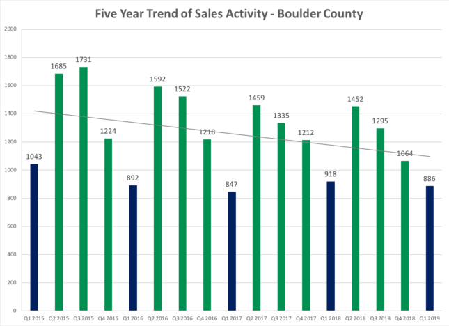
Comparing 1st qtr. 2019 to 1st qtr. 2018 sales decreased by 32 sales or 3.5%. The first two months of the year were down by more than this and March was a better month and helped the average.
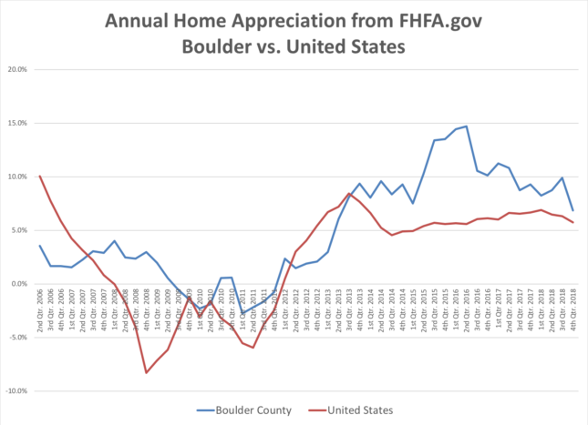
The graph above shows the median price for both Boulder County (blue line) and the United States (red line) since the second quarter of 2006. Each data point shows one year appreciation on a quarterly basis. The most recent quarter Boulder’s four-quarter appreciation was 6.85% which ranked it 97th out of 245 areas in the study. Over the past five years our cumulative home appreciation has been 60.11% which ranks 14th best in the nation.
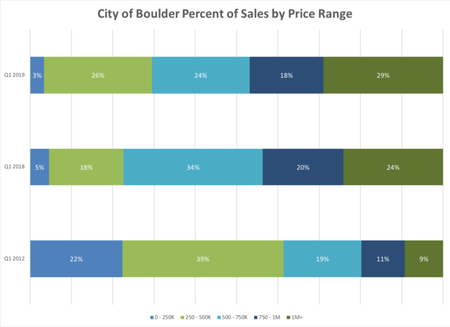
The bottom graph shows the sales which occurred in each price range during the quarter. The top bar is the most recent quarter, the middle bar is the 1st quarter a year ago. The bottom bar for comparison represents the sales mix during the 1st quarter in 2012. This graph is a good representation of how prices have increased, the entry level has shifted considerably to the right and the luxury market has grown.